Have you seen those beautiful looking sections on websites that have creative icons and images with small patches of text? Usually, you will find them showcasing important selling points about products and services. These boxes or modules as you would call them have been in fashion for quite a few years now, and most all premium WordPress themes have the option to create WordPress featured box. However, if you do not want to buy premium themes, you still can get them on your website with the help of a free plugin and a little bit of customization.

What Are WordPress featured box or Modules?
It is the tendency for most people to scan websites, instead of reading word by word. This goes onto say that if you are a business owner, you should focus on presenting your key selling points in an extremely easy to grasp and scanable manner.
It has become a common trend for websites to start with a large hero-style slider image with a call-to-action button, either inviting people to scroll down or click the button to visit an important page.
In most cases, just below the button, you will find a series of feature boxes, that display the critical selling points of the product or service being offered on the website. Sometimes, these boxes might also have individual CTA buttons, which can lead users to find out more about the particular feature.
Here is an example from a website that my friend is developing. It is for a Sleep Analytics Device.

Had they written a huge paragraph to mention all the things the device could do, most people would have skipped over that section. But, with the strategic use of colorful imagery along with small patches of text, one glance over the section is enough to tell you all the benefits of the product. This is the power of a feature box.
How to Add Feature Box with Images On Your WordPress Homepage
First thing you need to do is install a free plugin called Column Shortcodes from the WordPress plugin repository. Once that is done go ahead and activate it. After activation, you are all set to create beautiful-looking feature boxes for your website.
In the above example, the author has used images, but you can also use icons for your feature box. To get high-quality icons, download and install a plugin called WP SVG Icons.
Now, head over to the page where you want to create the Feature Box. I will be recreating the section from the above for this guide. I am using going to be using colors png icons, with the size of 200x200px.
Inside the back-end editor, you will notice a new [ ] icon right next to add media. That is the Column Shortcodes icon.
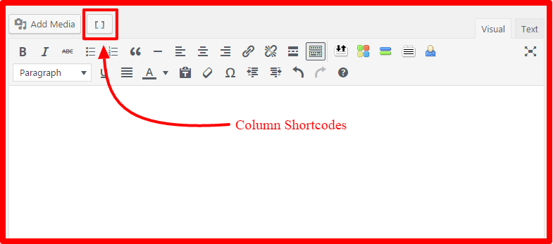
When you click on that, you will be presented with a screen like this.
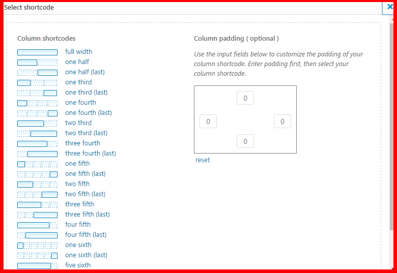
As you will notice, there are various options for dividing your page into columns. You can split the width into two columns by using “one half” or four sections by using “one fourth” and so on. For the purpose of this demonstration I will be using the “one third” column.
Clicking on the “one third” icon once will insert a shortcode like this into your WordPress editor.
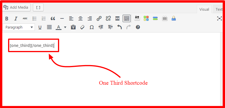
You can either copy and replicate the short-code, two more times, or you can go ahead and do the same steps to get something like this.
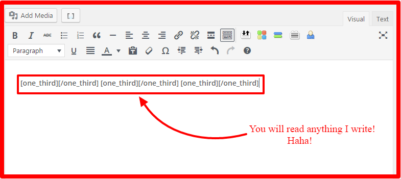
Now this my friend, will be the foundation of your feature boxes in WordPress. However, this is just one part of the section. If you want to do something like the example I have shown above for the sleep sense device, you can simply replicate the process to reach the desired result.
Now, comes the interesting part. I am assuming you guys know how to work with the default WordPress editor, so I won’t be going into details about how to insert the images or write the text. Moving on…
Now click your cursor between the ] [ brackets of the first column. To be precise your cursor should be at A. Clear?
Now, click on Add Media and insert the image. Once the image is inserted, click on it and align it to the center by clicking on the icon shown in the image below.
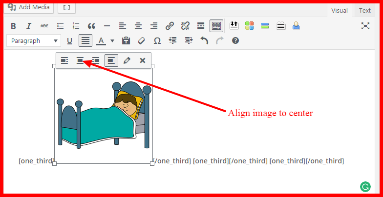
Once that is done, click the cursor just after the image, but before the [/one_third] shortcode. Type the text that you want to show with the image. Once you are done, select the entire text that you just typed and center align it, just like you did to the image.
Tada..
This should give you, your first feature box.
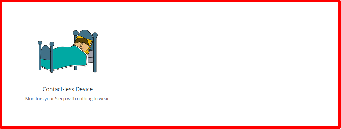
Do your due diligence now, and follow the same steps inside the second and third column sections that you had created earlier. Till you reach this state.
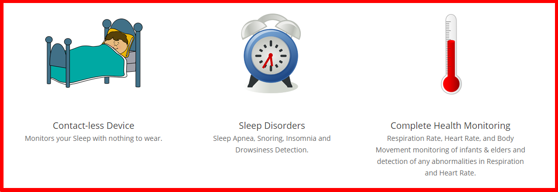
Repeat the same process again, for the next row and you will get the exact same layout from the example image.
So, this is as simple as it can get. No rocket science or confusing web development there.
Hope you found this tutorial helpful. For more such interesting tutorials and guides, stay tuned to our Facebook Page, where all the super cool stuff happens.
Until next time, have a good day.

You have illustrated the methods perfectly with images Anita. Thanks for that 🙂
Glad you liked it Gautham.
These are really great tips… Thank you so much for sharing! It is so hard to find a niche and be unique… seems like everything has been done already.
Thanks for stopping by Madhuri. Glad you liked it. 🙂