Mobilegeddon – Guide To Survival On The Internet (Checklist)
The Webmasters Guide To Survival On The Internet Post #Mobilegeddon Era (21st April 2015)

If your business heavily relies on Mobile Traffic, it would be wise to act fast! The Clock is ticking.
———————————————————————STOP PROCRASTINATING!—————————-——————————————
If you are reading this blog right now, then chances are that you have a website(s) or you are responsible for the online presence of your company/client’s websites. Back in February, Google announced an upcoming update that will take the Internet by storm. This update will target websites that are not fit for mobile viewing – So if your website is not mobile-friendly (now is the time to take action). Here is all the information and resources that you might need to make your website “Google Quality Compliant,” when the clock ticks into 21st April 2015. Make it or you will break it! No puns intended.
Contents:
-
What is Mobilegeddon?
-
Scope of the Update
-
Why did Google Take This Move? (Trend Analysis)
-
Estimating Your Present Mobile Traffic with GA
-
How to Avoid Getting Bitten By Google Mice?
-
Detailed Checklist of Things to do
-
Print-ready Checklist
-
Comprehensive List of Resources for Mobile-fixing
-
Verdict
#1 What Is Mobilegeddon?
The trend of mobile surfing has seen such an upward slope since the past few years that come 2016 – 60% of people who will surf the internet, will do so from their mobile phones and other portable devices. If you are not aware of what I am talking about, then you can check your Google Analytics to see how much mobile traffic your website is experiencing. Even without looking at it, I can state that any website today will at least be getting 30% of its user base from people surfing through portable devices. And it is safe to conclude that if your website is not user-friendly, you may be losing out on tons of cashing opportunities.
Mobilegeddon – is an informal term coined by SearchEngineLand in March 2015, to spread awareness about the impending Google epidemic that’s going to hit the web in April. Through this update, Google is going to give more importance to websites that are mobile-friendly, which means better rankings for responsive and user-friendly websites.
NO-MATTER HOW CLEAN YOUR BACKLINK PROFILE IS AND NO MATTER WHAT THE QUALITY OF THE CONTENT ON YOUR WEBSITE – IF YOU HAVE NOT TAKEN ANY MEASURES TO MAKE YOUR WEBSITE MOBILE-FRIENDLY – THIS ONE IS GOING TO HURT YOUR BUSINESS, IN ONE WAY OR ANOTHER.
On 21st April, Google will unleash the Algorithm which is going to scan each and every website on the web, and drop those websites from mobile SERPs if they are not “mobile-friendly.”
So what does mobile friendly actually mean?
In technical terms, “mobile friendly” demand websites to size their content to the viewport of a user and encompasses everything even remotely related to responsive designing. Speaking in layman’s terms – it basically means that if a user has to scale your website down to viewable size on mobile-devices (apparently because the desktop version of your website is opening on their mobile). Then your website is not “mobile friendly” or “mobile ready.”
Keeping up so far? Don’t be morose if you are not prepared for it. There are still a few days to go and you can work a solution these days!
#2 Scope of Mobilegeddon
This update is going to be Larger than PANDA!
THIS UPDATE IS GOING TO BE LARGER THAN PENGUIN!
ZinebAitBahajji – a renowned member of Google’s Webmaster Trends Team quoted at SMX Munich that this upcoming mobile-friendly update from Google is going to impact the search engine ranking of even more websites than what the Penguin and Panda have done in the past.
Let me give you a clear view of this scene – if you are still confused.
[blockquote photo=”” author=”” company=”(Panda 4.0) SearchEngineJournal 21st May 2014″ link=”http://www.searchenginejournal.com/hit-hardest-panda-4-0-answer-may-surprise/106461/” target=”_blank”]The past 24 hours have been a wild time for those who either work in, or follow the field of SEO. Google confirmed the rollout of two major updates, one of which was Panda 4.0, an update projected to impact roughly 7.5% of english search queries.[/blockquote]
[blockquote photo=”” author=”” company=”(Penguin 3.0) SearchEngineLand 11th Dec 2014″ link=”http://searchengineland.com/google-algorithm-changes-210285″ target=”_blank”]“I believe that the indisputable truth about Google’s updates belongs to Google only, and for all that we know, Penguin 3.0 impacted less than 1% of the English language queries. However, as with anything related to SEO, we can only take what we have and work ourselves out of the dark.” [/blockquote]
–
As you may be aware off, Google has its very inconspicuous ways of shedding light on its upcoming Algorithms. But, from whatever information it has given out on the Webmaster’s blog, the Internet is brimming with speculations as to how the update will impact websites and what measures can be taken to avoid it.
We are still unclear about what other factors would Google be looking out for during this update, and it is impossible to claim how drastically these factors will be able to change the website’s search visibility. From what Zineb commented at SMX, we can safely conclude that most of the non-optimized websites will be taking a blow from the ‘Google Mice’ a.k.a Armageddon … oops Mobilegeddon.
#3 Why Did Google Make This Move? Trend Analysis.
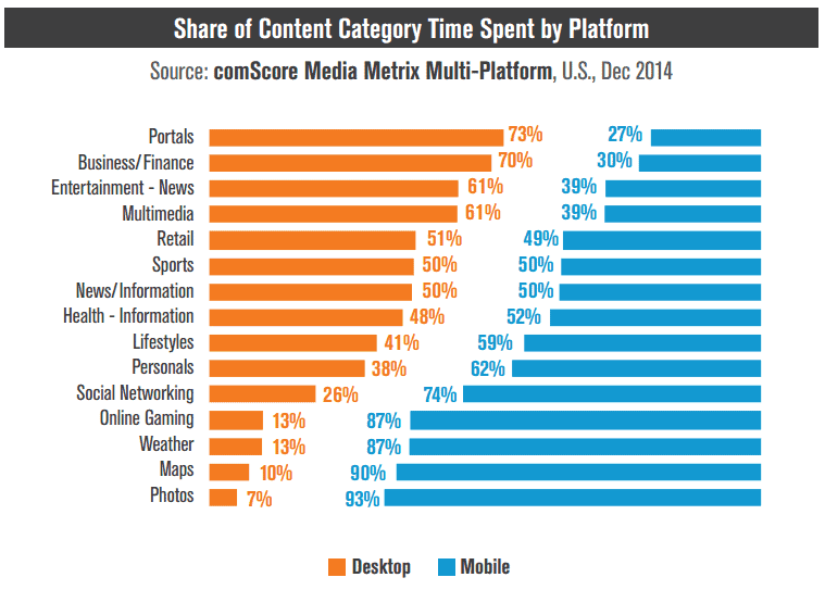
Statistics show that more than 60% of the searches performed on Google are now executed on mobile devices – so this only helps emphasize Google’s motive to take advantage of this traffic to ensure the best user experience for web surfers.
Let me explain the scenario better with the help of a few graphs. (Courtesy to ComScore.com for aggregating this data based on U.S. Demographics). This information is priceless.
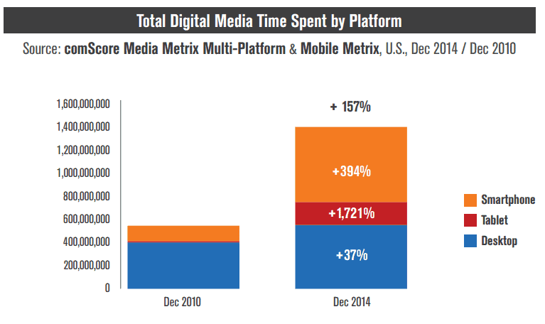
Compared to digital time spent in 2010 – Look at the growth in mobile usage for Web surfing in just 4 years. Do you think this is going to ever seize?
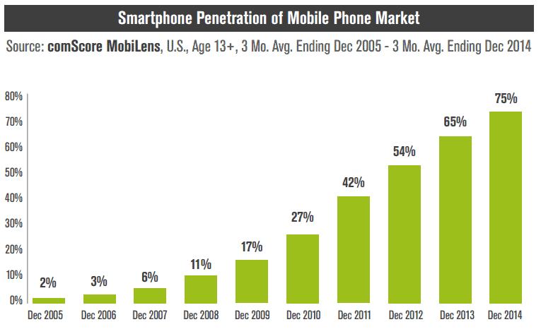
The Smartphone Penetration Of Mobile Phone Market – Beautiful upward curve that needs no explanation!
In addition to the upcoming algo, Google has already started rolling out some ranking changes that are based on information collected from indexed applications of Signed-in users. Though this appears to be a small change, it will have a large impact on the way search results are displayed on Google. Businesses that are really catering well to their mobile users will have the best benefits from Google this time.
ICE BREAKER
There was a short Q&A round with Gary Illyes (Google Webmaster), in which he revealed quite some information to break the ice, on what we can expect from Mobilegeddon.
- Responsive websites will not experience any major benefits in ranking.
- Googlebot must be able to crawl CSS and Java in order to pass the upcoming mobile-friendly test.
- Tablets and larger devices will not be affected by this update. Only mobiles and feature phones will.
- Google is presently working on making a dedicated mobile index – Crazy isn’t it?
#4 How to estimate your present mobile traffic? Google Analytics.
In order to understand how much traffic you could possibly lose from Mobilegeddon, it is important to understand how much organic mobile traffic are you actually getting?
If you do not know how to check your present Mobile traffic from Google, it’s fairly simple. All you have to do is log into your Google Analytics account:
- Click on Reporting on the Top Bar.
- Select Mobile under Audience in the Sidebar.
- Click on Overview.
Tada, you have all the mobile traffic information that you could possibly want.
So, once you are inside your Google Analytics, you can scrutinize the number of visitors that you are getting from mobile phones every month. Observe the image below, the upward shift in organic mobile visits is a clear signal of the increased use of mobile phones for surfing the web.
I am dealing with hundreds of websites every month, and 90% of this kind of upward slope is common for all these websites. This trend is so obvious, that I call in on some of my careless and lazy clients to observe their mobile trends and act accordingly in order to stay ahead of the competition all the time.
Why should you only optimize for mobile because of the oncoming Google update? Isn’t the whole idea already beneficial without having to take #mobilegeddon as a catalyst to fuel your interest?
So by studying the number of visitors your website is experiencing day after day, month after month – you can clearly estimate the number of visitors you may end up losing if your website is not effectively and timely optimized.
Here is a neat Case Study – Search Engine Land conducted on Moz.com to explain the process of estimating Mobile Traffic for a website that you do not own.
Say hello to “Mobile-friendly” Tags
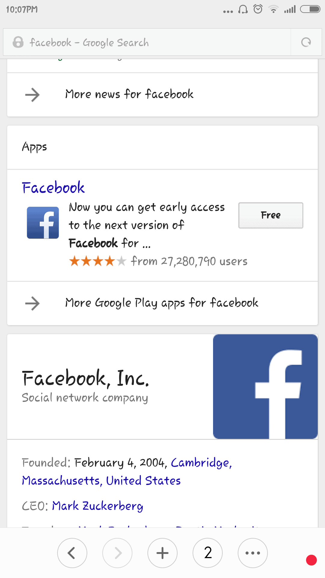
If you haven’t noticed this before, take out your smartphones and type any keyword into Google. You will notice that most of the first page entries have a “Mobile-Friendly” tag attached to them.
Just for the fun of it, I performed a quick search on Google with my Mi4 (Awesome Phone – !@$%Missing affiliate link). The keyword I selected is “Music Quotes” and here is a partial print-screen of the results.
Now you may notice that the first 2 results have a Mobile-friendly Tag, but the 3rd and 4th results don’t have a “Mobile-friendly tag.” Come 21st April, 2015 – I can say that these websites are going to be in trouble because they have not been optimized for mobile usability. (You can also keep it as a test and check on these websites when the day comes)
Write down the keyword – “music quotes”
Website No1 in trouble – quotegarden.com
Website No2 in trouble – musicmasterclass.com
Or do this experiment with a number of websites selecting a keyword from your industry.
Now, I am not saying that the first 2 websites are completely safe and prepared to face the upcoming update. But they may as well be in trouble for their other pages – You never know.
What you can do is, perform a few Google searches which your website is already ranking for and check if your website is getting the “Mobile Friendly Tag.”
Don’t just check your homepage, search “keywords” that display your Inner pages in the SERPs and see if you are still getting the “Mobile Friendly Tag.”
Perform the same check for your competitors and see if their pages are getting the “Mobile Friendly Tag.”
If they are and you are not, then you better buckle up your seat belts as they will get a massive advantage over you after 21st April, which they will enjoy for quite a long period of time. And if it’s the case vice versa, then Congratulations! You are prepared for the post #mobilemadness days.
Don’t just stop after you see the “Mobile Friendly Tag” for your website in the Google SERPs. This detailed guide will give you a clear view edge over your competition for many more days to come. There is lots of work to be done and there are only a few days – so keep reading!
#5 How Can You Avoid Getting Bitten By Google Mice This Time?
Before we jump into the Checklist of how to make your website mobile friendly, it is wise to brush along the sides of the subject (just the way Google like’s it).
- Allow Googlebot to access the JavaScript, CSS and Images files of your website.
- Don’t use any kind of unplayable content – Especially Flash.
- Avoid Faulty Re-directs. This can happen when you inappropriately redirect your desktop URLs to Mobile URLs.
- Don’t harass users by blocking them from viewing content with too many intrusive download links and messages or advertisements.
- Avoid cross-linking blunders. This can happen if you have multiple versions of the website and you redirect users to the wrong mirror page.
- Enhance your mobile site speed with Google PageSpeed Insights.
This is just the way Google likes it. Now head over to my all encompassing Checklist of To-Do things to dodge the April 21st Update and prepare your online business for the future.
#6 Checklist for Mobile Friendly Website (~Avoid Google Nerf)
With Mobilegeddon on the loop, and not many days for it set the Internet crazy – Here is my detailed checklist of things that you must take into consideration if you are a website owner or are responsible for the good health of your organization’s website.
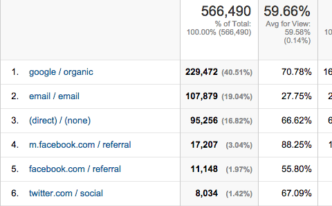
Look at the image above, this is a screenshot from the Google Analytics of Prime One Global. You can clearly see that we receive a steady inflow of footfalls through organic mobile search. Now, if we were to ignore this figure and not bother about mobile optimization before the 21st of April – you could call us sheer foolish (but, thankfully it is not the case as we are already up and ready, and we help others optimize their websites too).
You can be a designer, developer or another SEO company, or even someone managing a website, and this detailed checklist will help you with making your website mobile friendly. So even if you are in the website development phase or are planning to design one in the future – you can use this checklist to make your website Mobilegeddon safe.
1. GOOGLE QUALITY COMPLIANCE CHECK
With all the #mobilemadness #mobilegeddon hype on the web, it is easy to get swayed and puzzled about what you should do to make your mobile, website friendly, err… website – mobile friendly before the 21st of April. Before you even jump into the nitty-gritty of mobile optimization it would be wise to check if your website is already “As mobile friendly as Google wants it to be.”
Check the individual pages of your website with Google’s Mobile Friendly Test Tool, which will help you with detailed information regarding optimizing your website. And if most of the pages of your website are passing the test without a twitch, you can be rest assured that nothing too dramatic is going to happen to your online presence after the onset of 21st April 2015.
With this said and done, you can also read what the search giant has to say about mobile optimization in their Webmaster’s blog. There is another useful read which Google published back in November last year about helping users find Mobile friendly websites.
2. Determining your INVESTMENTS AND RETURNS
If you are reading this checklist, then most probably you did not pass the Google Mobile Friendly Test or you are just hunting for more information. Planning to optimize your website for mobile can call in for an enormous investment, especially because the algorithm in question is going to do a full-site scan and not just a site-wide scan. Even if you are ready to go all-in on mobile optimization it is crucial to determine the amount of investment you need to make – both in terms of money and resources. Don’t rush to a conclusion – Plan your moves and execute them one by one, to reap the best benefits in the long run.
It’s important to understand how much organic traffic you are presently experiencing from search engines. If you haven’t done this yet, now would be the ideal time to log into your Google Analytics (I hope you have integrated your website(s) with GA) and determine whether there has been an upward shift in the amount of traffic you have been receiving in the past few months. If you notice that your business is receiving less than 10% traffic through mobile devices, it could mean one of the following things:
- Your website has poor SEO, which is resulting in poor organic traffic.
or
2. Your website has poor Mobile Optimization and that is why it’s receiving less traffic.
or
3. your business model doesn’t call for mobile viewers (9 out of 10 times this will not be the case)
Now if you are already experiencing very little traffic from mobile, I would suggest taking the slower route for this process as you may have more time than you really think.
But.
Let’s say, 30-50% of your organic traffic is from mobile phones, it calls for a faster and effective mobile strategy implementation.
How do you determine what amount of money and resources to invest?
The safest bet would be to allocate the same amount of money and resources that are available to you, to equal the share of mobile to desktop traffic that your website has been experiencing over the past few months.
3. BUILDING A MOBILE APP TO ENHANCE USER EXPERIENCE
Even though Google introduced the App indexing feature to display applications in search results back in October 2013, it’s still a powerful way of enhancing the overall user experience of your brand.
It is not rocket science, we know that Google is driving these updates with a strict motive to give users the best search experience possible – Thus, if your business model can support an App for the users, it would be one of the best times to plan this out.
You may be wondering how on earth will you plan and execute an App development campaign before the 21st of April. Well, you don’t need to hurry about this; you can take your time and scale this into one of your marketing projects for the future.
Obviously, everything boils down to your capacity to invest/allocate (money and resources) at the moment, but again – you can keep this in mind for the future.
4. RESPONSIVE / DYNAMIC / PARALLEL
There are rumors that Google loves Responsive designs more than Dynamic URL Segmentation or Parallel URLs, but this is completely untrue. I have run quite a few tests in the past weeks, especially after Google’s Feb 4th Update, and I can assure you that if your website is mobile-friendly there is nothing to worry about.
If you are unaware of which configuration option you should select for your website, then here is a description for a clear view:
- Responsive Design: This configuration serves the same content to desktop, mobile, and tablets by using CSS3 elements. So, the contents of your website will automatically resize for perfect display according to the device it is being viewed on. This configuration is the best because there is no duplication of content and there is no need to handle multiple mirrors of the same content. You just have to manage one single website. The only disadvantage of this configuration is that you cannot segregate Mobile only content nor have different content for different platforms.
- Dynamic / Adaptive Design: This option is almost the same as responsive design as you will be working on a single URL but, different HTML and CSS codes will be presented to users depending on the device they are viewing your website from. The only con of this configuration is that you will have to re-write the code of your website every time a new mobile device is released.
- Parallel URL Websites: Even though this is one of the most strenuous of all the options available, it still has its perks for those websites which need to laser focus on the mobile experience of their visitors. Opting for a Parallel URL website is like having a separate subdomain for example (m.yourwebsite.com or mobile.yourwebsite.com). Its cons include having to manage the mirror image of your website and dealing with duplicate content etc. Every time your website is updated, the changes have to be reflected in the other domain as well.
5. USING USER INTENT FOR ENHANCED VISIBILITY
It is not an unknown fact that most of the searches that are performed on the move are done via mobile phones and other hybrid devices. According to research, more than 80% of the searches performed on mobile are with local intent.
This means that people are most often looking for local addresses, telephone numbers, stock availability, and other business-related information via mobile phone. With this in mind, ask yourself the following questions:
- Do customers come to my shop or office?
- Do I have a helpline to deal with customer inquiries?
- Do I sell goods and services that have the tendency to out-stock?
The answer to all these questions will mostly be a yes, and thus it may be a crucial business booster if you can place your Contact and Stock Information like (Map, Address, Contact Numbers, Email Id, etc) before the other information on your website, it will greatly boost conversions of your mobile site.
6. CREATE A MOCKUP FOR YOUR MOBILE WEBSITE
Before you jumpstart your mobile optimizing or website development journey, it is crucial to have a simple mockup of what you would like your website to look like in the end. You can use different mockup creation tools like Adobe In-design, Photoshop, etc., but just don’t trade the comfort of your users for elements that make your website too heavy to load or don’t appear properly on all devices.
Also take into consideration that some of the aspects of your desktop website will be difficult to convert to a mobile version, for example, the navigation menus or mouse hover menu reveals. These features never adapt to mobile websites, so you must look for better alternatives. Now let’s take a detailed look at the creation of your mobile website wire-frame.
i. Development: Remember to put the meta viewport tag on top of all your pages. If you took time out with the Google Mobile-Friendly Test Tool, then you must have already fixed this up.
ii. Readable Fonts: Is your content legible for mobile viewing? If viewers have to constantly pinch the screen to change the size of your font, this does come as an obstruction in fluid visibility. Google recommends 16 CSS pixels and a line height of 1.2em.
iii. Distance Between Touch Elements: Ensure that all touch elements of your website have a considerable gap between them, or users may end up clicking the wrong button. This is the primary cause of increased bounce rates, low sales, and possible frustration or agitation among mobile surfers. Make sure that your Call-to-action button is clearly visible and accessible on all devices. You can also check if Google has picked any element of your website for being inaccessible in the Mobile Usability section of GWT.
7. AVOID HORIZONTAL SCROLLING IN MOBILE SITE
Even though this one is obvious, it wouldn’t hurt to have it in the checklist. Mobile surfers are used to vertical scrolling to view hidden aspects of a website, but if users have to scroll horizontally to read between the different sections of your website, then it may cause problems in user experience as they will mostly have to pinch the screen to resize it for a complete view.
This problem is also easily traceable through the Google Webmasters Tool.
NOTE: You can avoid getting this error in GWT by using relative width and position values in the CSS and also making sure your images are scaled properly.
8. OPTIMIZE FOR FASTER PAGE LOADING ON MOBILE
Again, this is a no-brainer. The user’s type of device and data connectivity also plays an important part in the mobile surfing experience. Even though the world is blessed with 4G connectivity, more than 60% of people who are surfing the internet, do so through 3G connections. You wouldn’t want to properly optimize your website in all aspects and then lose out on precious leads or sales because your website was not able to load completely on slower devices, would you? There are variable controls that can be tweaked to achieve the best results but the first thing you should do is to head over to Google Page Speed Insights Tool to see what Google says about your website load time.
NOTE: You can do things like compressing images, minifying codes, and leveraging browser codes to enhance the load speed of your website(s).
9. AVOID FLASH AND DON’T BLOCK CSS, JAVASCRIPT, AND IMAGES FROM GOOGLEBOT
If you are using any flash elements on your website, now would be the time to get them removed. HTML5 is one of the best alternatives to flash elements on a website. We say that flash is not good for the mobile experience because Flash is not readily available on all mobile devices. Due to this, it may cause an erroneous mobile viewing experience for your users.
And the first thing that Googlebot will check when it crawls your website is for blocked CSS, JavaScript, or images. If it finds that any of these elements are blocked from crawling, then it will mark your website as “not-mobile-friendly.”
10. DISPLAY RELEVANT KEYPAD FOR FORM FIELDS
This is one of the most overlooked factors when it comes to mobile optimization and I have personally seen a 30% growth in opt-ins and leads from mobile visitors, when websites optimized their forms do display the right keypads. Check out your existing forms and see what the users will have to fill in separate fields. Check if the respective fields are displaying a relevant keypad. Having a ‘number keypad’ displayed in the contact number field and an ‘email-keypad’ displayed in the email form field will greatly enhance the mobile experience or your viewers and is worth tweaking.
11. CONTACT NUMBERS TO OPEN IN DIALER APP
My dad is not aware of how to copy and paste things on mobile phones and so are the majority of the people in this world. You must take this into consideration when optimizing your website for mobile because having to copy the number and paste it in the dialer or even write it down on a piece of paper makes the whole process cumbersome and messy. Sometimes, it may even result in people leaving your website without contacting you. Ensuring that clicking on your contact number opens the dialer app will get you those visitors who might be stuck on the fence just because they are unable to call you without leaving the screen or memorizing your number just to forget the last few digits when they are frantically typing into the dialer pad. Think about it.
12. HAVE YOUR WEBSITE TESTED INHOUSE OR HIRE PEOPLE
During the development phase of your website, it might be a good idea to constantly see how well it is performing on variable devices. This can be done through various emulators available online or you can manually do it on various devices (Borrow from your colleagues or family members).
Mozilla Firefox and Google Chrome, both have this nice ‘Inspect Element’ feature that lets you view your devices as seen by other devices – This is a very handy feature that I sometimes overuse.
Alternatively, you can also hire a bunch of testers or even organize an in-house event where the members are asked to surf your website in various mobile devices and give their inputs after 10-15 minutes of wading through your pages.
After the demo run, you can the testers to pen their individual feedback and collate them later on to pick up bits and pieces that need enhancing. Sometimes, it is just better to have someone else analyze your website because they will only think from a user’s perspective and tell you very obvious things that you may overlook, just because your brain is clustered with lots of plans and ideas.
Ending Note
This is my all-encompassing checklist of website mobile optimization. I have helped a lot of my clients cope up with their mobile optimization needs, so if you need any help you can always ask for assistance on the Facebook Page or even in the comment section below. If you have any questions or want me to add something to this checklist, again, the comment section is a few blocks away.
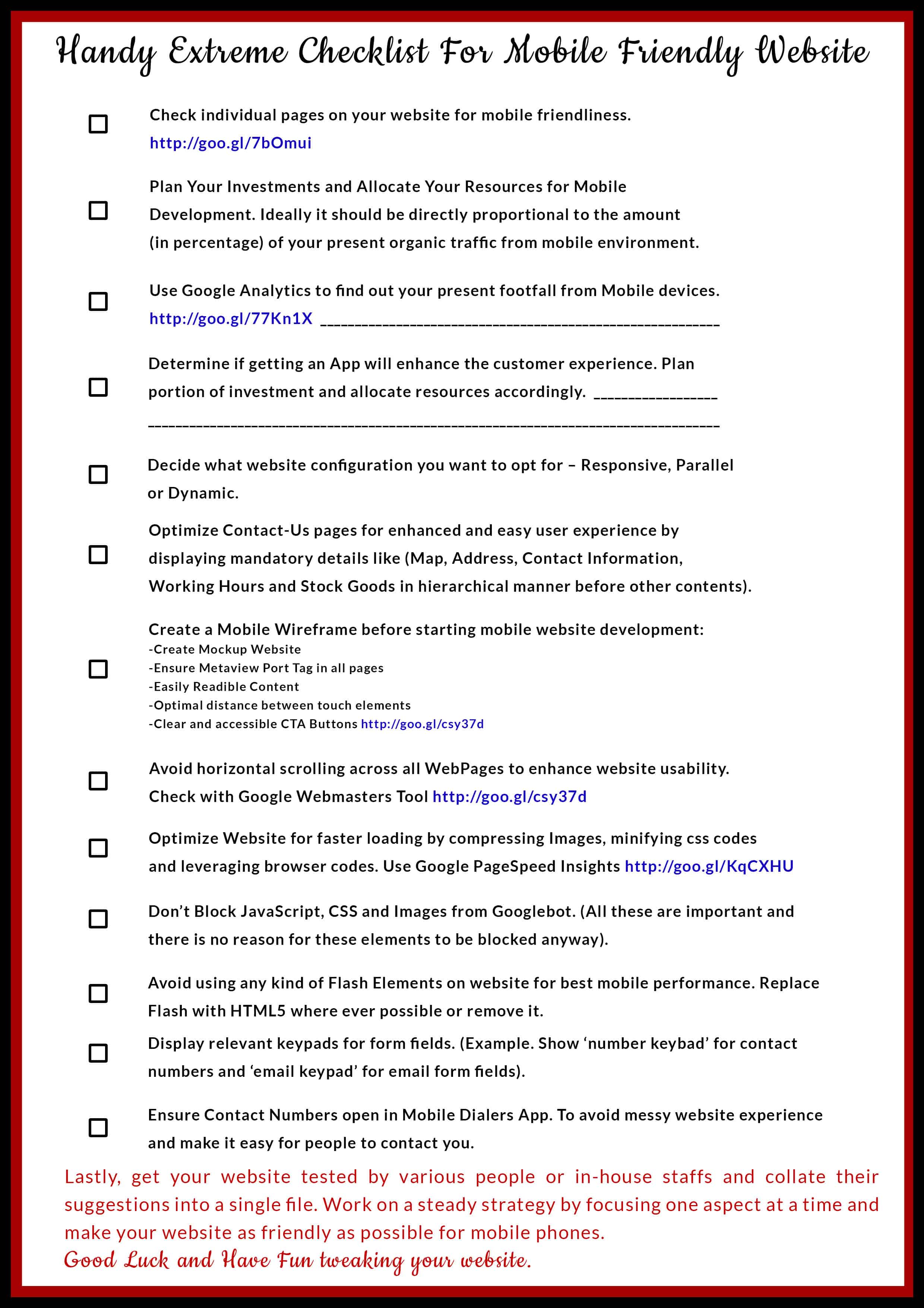
#7 Print Ready Extreme Checklist for Mobilegeddon
Here is the download link to the print-ready version of this checklist for your convenience. Don’t forget to pin this checklist if you found it useful.
#8 List Of Useful Links And Resources Related To Mobilegeddon!
- Google Algorithm Database – List of all Algorithms updated will date.
- Google App Indexing Service – Want to get your app featured in SERPS? This is the door.
- Google Mobile Friendly Website Guidelines – Self Explanatory
- Google Mobile Friendly Test Tool – Check if your individual pages are mobile friendly.
- Google Mobile Usability Report – Get instant reports on mobile usability issues.
- Google Webmaster’s Help Forum – Ask Google for help!
Here is a list of Big G’s Guidelines for optimizing various leading CMS or similar platforms:
- WordPress
- Joomla!
- Drupal
- Blogger
- vBulletin
- Tumblr
- DataLife Engine
- Magento
- Prestashop
- Bitrix
- Google Sites
Here is a list of guides that can be used to change your not-so-responsive website into a “Responsive website.”
- Design a Skeleton Website
- Bootstrap Website Downloads : CSS/Java/Fonts + Source Code Rails/Compass/Sass
- Responsive Grid System Website Toolkit
- Advanced Responsive Website Designing Tutorial – Advanced HTML and CSS.
Extra Resources:
- List of different options for mobile navigation menus.
- Mashable’s list of top online wireframing tools.
In the end, it depends on what your website is focused on and what business models you are following. There are a few things however that need no excuse not to be followed and doing the basic mobile optimization checks is one of them – After all, who doesn’t like an extra influx of visitors from mobile phones.
Unless you are from the underworld, in which case you will be using the .htaccess file – a few people will get what I mean and #5MinutesOfSilence for the people who don’t. Haha.


