Brand Guidelines
This guide is a high-level overview of how the Prime One brand comes to life. As our brand has evolved to meet the digital expectations of everyone from startups to industry titans, here, we propose a brand-new style guide that keeps our brand's essential characteristics that are easy to follow and adaptable to a variety of applications.

Prime One Global is a multinational award-winning performance marketing agency headquartered in Sri Lanka with an office in DE, USA that works with some of the world’s leading brands and Fortune 500 companies. With our smart marketing solutions, results-driven strategies, and inspiring support, we focus on delivering effective and innovative digital transformation and brand activation solutions to help brands grow their business efficiently and sustainably.


The Logo
Prime One uses only one logo for the branding. Always Use the complete logo and you are welcome to use it on a dark or light background as displayed, but it cannot be substituted with any other color.
Our logo can be resized to fit different screen. But, the Prime One Logo must be crystal clear and visible, whether you see it on a smartphone or a large screen in a stadium.
Logo Misuse and rules
The wordings of the logo should always be landscape and should be inside the logo. Make sure you are using the full logo in landscape, and it’s not to be edited and dimensions adjusted.


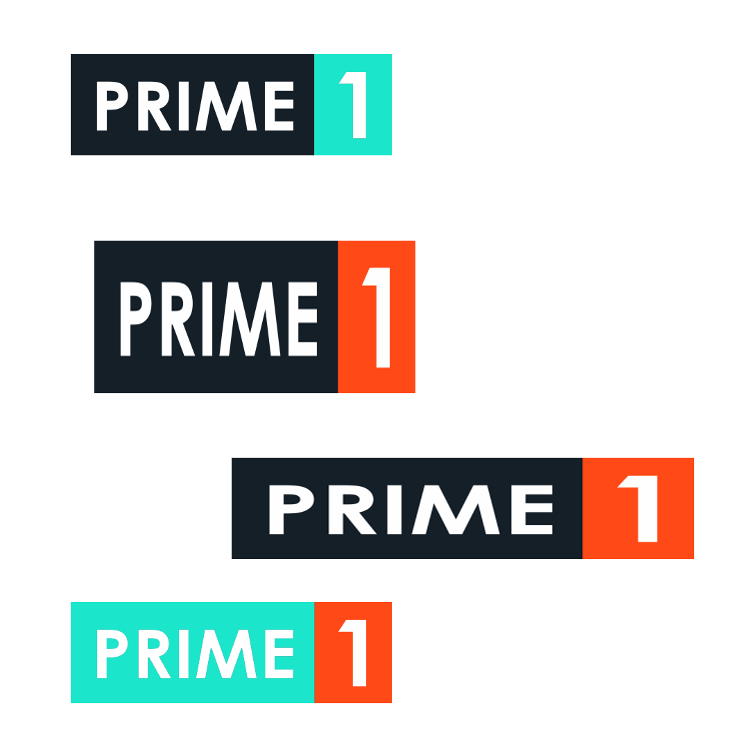
X Do not change the background color of the text

X Do not resize the logo. Use it in the correct dimension given.

X Do not change the background color of the number
✔ If you are syncing the Prime One Logo in a picture, the complete logo should be used and the logo cannot be sided with the picture's edges. The logo should be placed with at least 1px of space between the edges of the logo and the picture.
The Color
Our well visible three colors are iconic to us. It's one of our most distinctive assets. From the color of our themes to our logo, the Prime one's primary colors are Red Pink, Black, and Light Gray. Alternate colors cannot be mixed among themselves; they can only be used with the main color as shown.
Color Value
RedPink:
WEB: #ff4917
RGB: 255 | 73 | 23
CMYK: 00 | 85 | 98 | 00 |
Color Values
Black:
WEB: #152029
RGB: 22 | 32 | 41
CMYK: 83 | 71 | 58 | 69 |
Color Value
LightGray:
WEB: #F2F2F2
RGB: 242 | 242 | 242
CMYK: 0 | 0 | 0 | 5 |
Typography
Cerebri Sans and ubuntu are our two primary fonts, and we use Monserrat as an alternate font. We'll add bespoke tweaks with different weights and styles to these typefaces when a different touch is required.
Primary Font
ubuntu
Light
Light italic
Regular
Bold
Altenate Font
Montserrat
Light
Light italic
Regular
Bold
ubuntu
Light
Light italic
Regular
Bold
Montserrat
Light
Light italic
Regular
Bold
Logo with Image Sync
If you are syncing the Prime One Logo in a picture, the complete logo should be used and the logo cannot be sided with the picture's edges. The logo should be placed with at least 1px of space between the edges of the logo and the picture.
Using Logo in picture

Text with image sync
In case you need to use text in an image, you must consider the brightness of the background. The text should be put with a correct backdrop color chosen from the branding's primary colors, as indicated.

Get in Touch With Us.
Ready to build the right digital foundation for your brand? Get started with a Smart Digital Marketing Strategy.
