The popularity of webinar marketing has skyrocketed in 2020. Just about every business and marketer is hosting webinars these days.
So, Do you also need Webinar Software? Oops, That’s a big question! As, once you decide that you actually do need one, there’ll be another important question that you need to find the answer is which of the dozens of webinar solutions should you choose?
When going digital with your clients, you’ve probably dealt with an unstable internet connection, audio issues, software bugs and many more. That’s why it’s really important to choose the right webinar platforms.
So, which are the best webinar platforms 2020? Glad you asked!
I’ve come across and tested the most popular webinar platforms 2020. Some, I liked, others, I couldn’t get around with their technical bugs or simply, the apps didn’t fit my needs.
Maybe you run a small business, startup or blog, regardless of the situation, I’ll cover everything from pricing, features, to pros & cons for the best webinar platforms on the market.
Here we go! The following list of 20 webinar platforms is my absolute best picks for 2020. Keep reading to gather more info on how these webinar platforms work!
1. What is a Webinar Platform?
A webinar platform is an important tool or software that helps you run online live events or meetings with one or more attendees. Since there are lots of elements that go into organizing and running an online meeting or event, so, a software tool that’s specifically designed for this job provides a list of features that the webinar creator (host) use during the process.
The best webinar platform is able to cater to many needs such as managing and following up with attendees, providing in-depth detailed analytics and displaying Call-to-Actions (CTAs) so that participants are compelled to obtain what the presenter has to offer.
There is a wide range of webinar platforms on the market, especially since webinars have become increasingly popular during the COVID-19 pandemic in 2020. Each webinar platform has its pros and cons, but the main focus of these webinar platforms is to offer the best user experience for attendees while making it easy for the host to run the online meeting and effectively interact with his/her audience.
2. Key Benefits of Using Webinar Platforms
Can you imagine having to juggle with various tools to run a successful webinar that need to be integrated with one another and work together seamlessly? I know it’s a tiresome job!
That’s where webinar platforms come in, most of the webinar platforms are “all-in-one” products where you get all the features and functionalities you need in one place. For example, the best webinar platforms allow for easy internal communication, customer interaction, remote team meetings, marketing presentations, Outreach & lead generation, and web-based training with the use of high-quality visual and audio presentation.
Inexperienced marketers and entrepreneurs often oversee the potential of the webinar which is a great mistake. There are plenty of success stories speak of people doubling, tripling or even quadrupling their email list through webinars. Also, well-presented webinars help people to make five or even six figures in their sales.
Webinars are very much alive, more than they’ve ever been. Here are some key benefits of using webinars in your business:
- Webinars are the best way to automate and track your marketing efforts
- Webinars will position you as an expert in your niche industry
- Webinars will help you boost your audience’s engagement
- Webinars can help you attract other people’s audiences
- Webinars can be automated and scaled easily; in result, you will get a constant stream of leads for your business.
In nutshell, when you’ve got an army of people who’re eager to promote your webinars for you, the possibilities are endless!
Top 20 Emerging Webinar Platforms 2020 for Startups and Individuals
You know what? There are more than 30 active webinar startups and services in the market. Interestingly, most of them are founded in the last 2-3 years. When I started my research I used strict criteria to compare, analyze and review the top 20 webinar platforms 2020 such as webinar platform’s flexibility, easy usage, features & Functionalities, registering experience, attendee experience, follow-up experience, etc.
That being said, let’s have a closer look at the top 20 webinar platforms 2020.
GoToWebinar is owned by LogMeIn and marketed along with the GoToMeeting software. It’s one of the most popular and best webinar platforms for good reason. GoToWebinar is trusted by more customers than any other webinar platforms in the market and it powers millions of webinars each year.

Whether you use webinars for marketing outreach, corporate communications or training, GoToWebinar provides you with reliable technology that’s super simple to use. You can get the features, functionalities, integrations and analytics you need to engage your audience and make personal connections that help you thrive in your business.
When your reputation is on the line, you need a solution you can rely on and GoToWebinar is that webinar solution for you.
Pricing
- STARTER –€89 Per Month / Billed Annually – 100 Participants
- PRO –€199 Per Month / Billed Annually – 500 Participants
- PLUS –€429 Per Month / Billed Annually – 1000 Participants
Features
- Generate data reports for source tracking, attendees, and events.
- Integrations are available for the biggest and most popular CRMs and marketing tools.
- You can record and re-record your meetings and events for later viewing.
- Simple engagement features with webcams, polls, and a dashboard to monitor the type of engagement coming in.
- You can get planning and promoting tools like webinar templates, scheduling, and branding.
Pros
- Compare to the competitors, GoToWebinar is more flexible
- Beginners can start working with GoToWebinar without much training.
- Webinar participants can connect and interact with the presenter via chatting and virtually raising their hands.
- Presenters can stream webinars from all devices
- Marketing and analytics tools are the best options for businesses
Cons
- GoToWebinar frequently update its software which can be frustrating to often download the new version
- GoToWebinar recording quality could be better.
- Some businesses might not like the higher monthly fee, but this totally depends on the size of your organization and how many participants you have per webinar
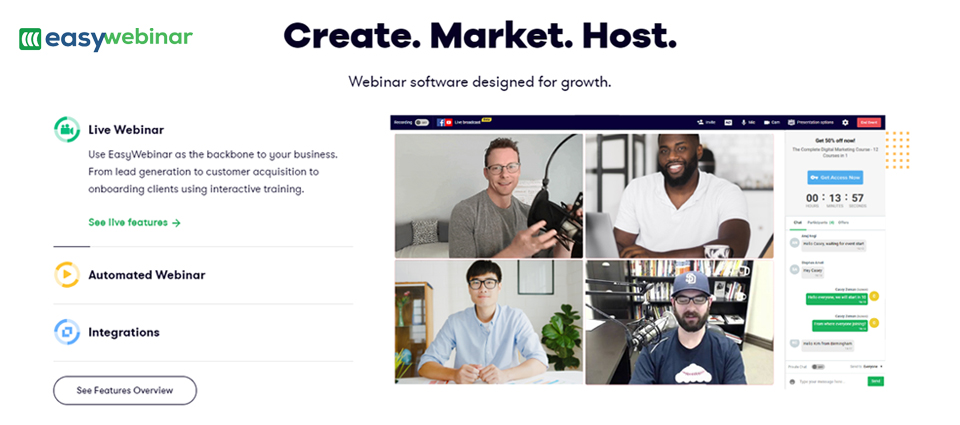
EasyWebinar is another popular webinar platform 2020. You can Use EasyWebinar as the backbone of your online business.
The platform offers tools for marketing outreach, lead generation and customer acquisition with interactive training onboarding.

EasyWebinar is both a live stream platform and marketing automation tool. You can leverage the platform to conduct workshops, webinars, and masterclasses to rise above your competitor while also allowing you to scale up your marketing through automated and live webinars.
Leverage the power of EasyWebinar to do more and grow your business to new heights.
Pricing
- Standard – $78/Month – 100 Live Attendees
- Pro –$129/Month – 500 Live Attendees
- Enterprise –$499 /Month – 2000 Live Attendees
Features
- Provides Alerts and Notifications
- Offers tools for event management
- Multi hosts option
- Reporting and analytics tools for the better marketing process
- Live Chat, Q&A and HD Screen Sharing facilities
- Offers social media promotion and customizable branding
- You can record and archive your webinars
Pros
- Provide a live chat feature for the audience.
- You can able to share your screen, your webcam feed or PowerPoint Presentation in just one click.
- EasyWebinar has a strong structure that ensures the stability of your webinars.
- EasyWebinar offers good customer supports with its supportive staff and training videos that help you get started and take full advantage of the features.
Cons
- Personalized branding is only available for higher monthly subscriptions plans
- EasyWebinar full suite of features can be a bit daunting at first
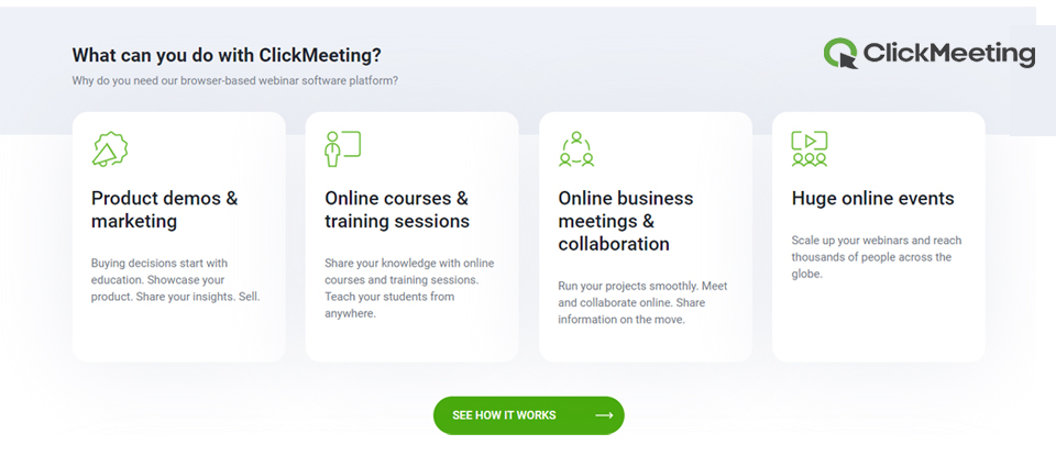
ClickMeeting is a browser-based all-in-one webinar solution. This webinar platform suitable for organizations of any size, from individual firms to multinational enterprises.
This web-based webinar platform is easy to use and covers the entire process of the webinar from preparation to presentation and from attendees’ interaction to follow-up.

What’s even better about ClickMeeting is that all its features come at a very reasonable price if you choose the right plan; getting started webinars is much easier with ClickMeeting.
Pricing
- Free Trial –For 30 Days
- Live –US$ 25/Month – Billed Annually
- Automated –US$ 40/Month – Billed Annually
- Enterprise –Custom Pricing
Features
- Provides automated and evergreen webinars
- You can run paid webinars
- Provides Custom branding options
- You can send customized attendee invitations
- Whiteboard feature Available
- You can live stream your webinars to Facebook or YouTube Live
- Options to do Polls and surveys
- Offers simultaneous chat translation feature
- Mobile app available
- You can get advanced analytics and statistics
- CTAs options available during and after the webinar
Pros
- Extremely feature-rich professional webinar solution
- The platform has an Intuitive and easy interface
- Reasonable pricing options
- Offers great engagement enhancements
- The webinar platform works well with a large number of audiences
- Perfect webinar solution for Follow-Up/Live Webinar task automation
Cons
- The platform does not allow scheduling recurring meetings.
- The analytics and statistics aren’t as detailed as they can be, but you can get basic data
- Lengthy webinars take a long to export
- Limited storage options
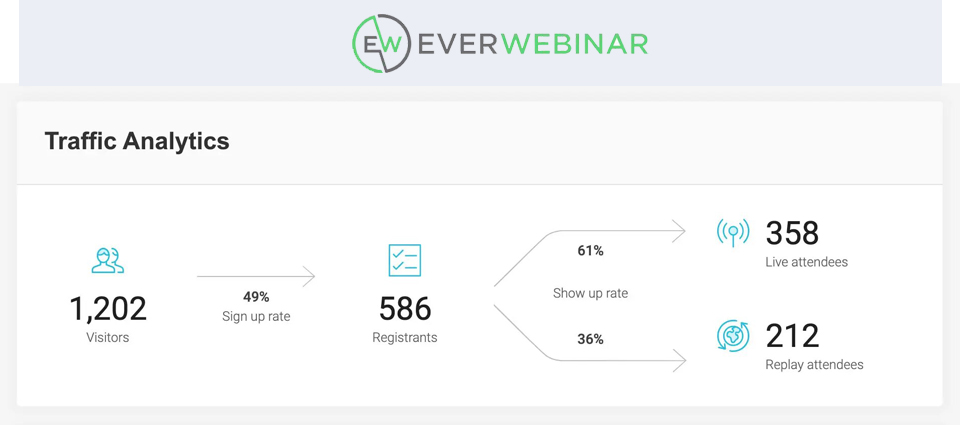
EverWebinar is owned by the same company that runs WebinarJam. According to the name, EverWebinar lets you create evergreen webinars that are pre-recorded but look and feel live to the audience.
EverWebinar completely automates the operations and provide the best live webinar experience for customers. You don’t need to install, upload or host anything EverWebinar handles it all for you.

EverWebinar is packed with lots of features that help you put your webinar process on autopilot.
Pricing
- Installment Plan –$1 for 14 days then $199 x 3 Yearly
- Annual Plan –$1 for 14 days then $499 Yearly
- Biennial Plan –$1 for 14 days then $799 Two Years
Features
- Flexible scheduling – your audience can decide when the webinar will be broadcast.
- Pre-record your webinars and make them evergreen.
- Provides pre-made landing pages and registration pages.
- You can get high-def 30FPS video and audio features.
- You can display clickable offers during the webinar with built-in scarcity elements
- Live chat option available.
- Provides multiple features such as email marketing software and CRMs like ActiveCampaign, ConvertKit and more.
- You can keep your audiences engaged with a built-in email and SMS system.
- You can run polls, questionnaires and surveys by your attendees.
- “Hybrid Webinars”: Webinar is pre-recorded, but still you can chat with attendees in real-time.
Pros
- You can turn a live presentation into an evergreen broadcast in minutes
- Offers great in-depth analytics
- Automatic time-zone detection lets your audience choose the best time for them to watch the webinar
- You can put the webinar process on autopilot
Cons
- Works great with WebinarJam, but purchasing the two can become a little expensive.
- Streaming webinars on mobile might give a few glitches.
- Some might not like the fact that the webinar is portrayed as live when they’re actually pre-recorded.
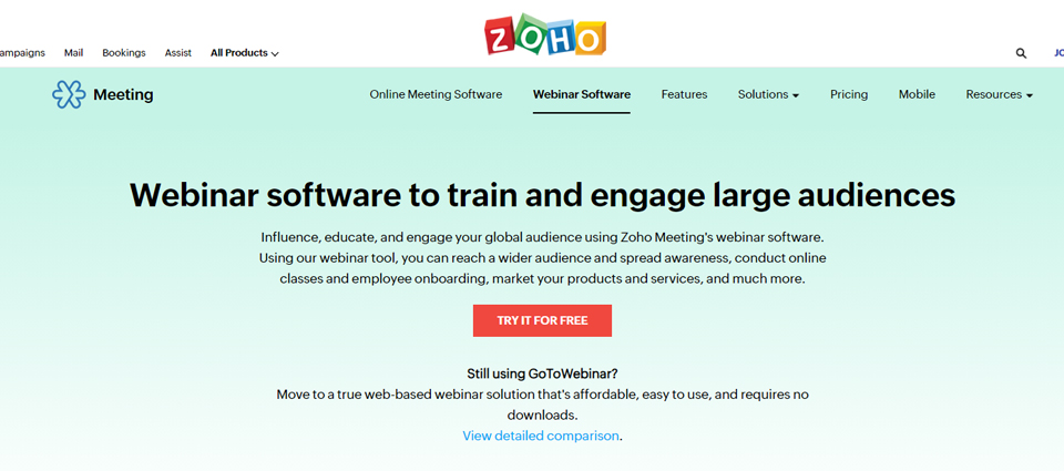
The Zoho brand is well known for its wide range of simple, reliable and affordable products. Zoho Webinars is part of the Zoho Meetings software that helps smaller firms an affordable way to conduct webinars.
Zoho Webinars aim to make webinars extremely affordable for smaller organizations, without compromising on the quality and the overall user experience.

Zoho Webinars has a great UI and design together with engagement-enhancing features and excellent customer support.
Pricing
- WEBINAR 25 –$15/Host/Month Billed Annually – 25 Attendees
- WEBINAR 50 –$23/Host/Month Billed Annually – 50 Attendees
- WEBINAR 100 –$31/Host/Month Billed Annually – 100 Attendees
- WEBINAR 250 –$63Host/Month Billed Annually – 250 Attendees
Features
- Registration page customization with embed registration widget
- Automated email reminders and follow-up
- All web-based webinar solution
- Provides interactive polls and Q&As options
- Offers Presenter-switching options
- Provides reporting and analytics features
- You can integrate with other apps
Pros
- Affordable when compared to similar webinar platforms
- Simple and easy to use interface and design
- Excellent customer support
- Provides Dial-in function for attendees
Cons
- Support only limited numbers of attendees
- Analytics can be improved and more in-depth
- Apart from an email, other automation is not that strong
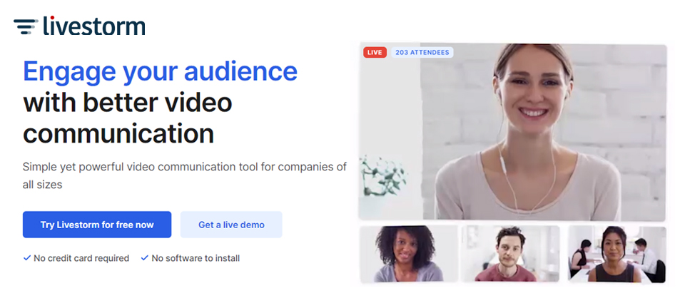
Livestorm.co is the web-based webinar platform for hosting customer training sessions, demo, etc. Livestorm.co fits for companies of all sizes.
Livestorm.co user-base is continuously growing because people love its modern and clean interface. Also, it’s extremely rich features can cater to all webinar needs.

Livestorm.co be aware of fact that webinars come in all kinds of shapes and sizes; therefore, it offers various modules and tools for specific webinar styles like, live events, customer training, online courses, product demos, video podcasts, hiring sessions and many more. Altogether, Livestorm is a powerful ‘video meeting’ software.
Pricing
- Webinar Basic –Free
- Webinar Premium –€89/Month, Billed Annually
- Enterprise –Custom Package
Features
- Provides unlimited HD-quality webinars
- Web-based webinar platform
- You can play pre-recorded videos during webinars
- Offers both real-time and reusable polls options
- Provides customizable branding features
- You can have embedded registration forms anywhere
- Provides advanced analytics options
- The platform provides unlimited recording storage
- You can automate your emails
- The platform’s whole interface can be translated into 17 different languages for corporate webinars
Pros
- Modern and clean interface that’s easy to use
- Great email automation options
- Excellent landing-page templates
- Offers a free plan for users to get started
- Great automation tools
Cons
- Users have reported some problems with webinar video quality
- The free plan only supports limited attendees and the event is capped at 20 minutes
WebinarNinja is an all-in-one webinar marketing solution. The Conversation-centric webinar platform makes it easy for businesses to teach market and sell their products/services via webinars.
The webinar platform provides built-in landing pages, email sequences, slide templates and comprehensive tools to create live, automated and hybrid webinars.

All these above-mentioned features, intuitive UI and step-by-step process of WebinarNinja makes it stand out among competitors.
Pricing
- STARTER –$39/Month, Billed Annually – 100 Live Webinar Attendees
- PRO –$79/Month, Billed Annually – 300 Live Webinar Attendees
- PLUS –$129/Month, Billed Annually – 500 Live Webinar Attendees
- POWER –$199/Month, Billed Annually – 1000 Live Webinar Attendees
Features
- You can create Live, Automated, Hybrid and Serial webinars on WebinarNinja.
- The host can able to display live polls for the webinar audience to answer.
- Provides proprietary hosting for automated webinars.
- Email notifications and automation with drip campaigns.
- The platform’s Media Library allows you to store images, logos, etc.
- Provides advanced statistics.
- Countless built-in integration + more than 1000 integrations are available via Zapier.
- You can create paid webinars.
Pros
- Modern, clean and very intuitive user interface.
- The platform provides a super-fast and reliable chat feature.
- Well-designed templates pages and have a proven record of conversions.
- Good audio and video feature back up Web RTC technology.
Cons
- Some users have reported poor video quality.
- “Polls” and “Offers” features can be improved.
- Webinars running time is limited to 2 hours.
BigMaker is definitely one of the top players when it comes to webinar platforms 2020. It’s trusted and used by world-class brands like Google, McDonald’s and Panasonic.
BigMaker combines powerful video technology with a robust marketing and interactive experience that lets you create so much more than just live webinars. BigMarker allows you to record automated and evergreen webinars, host on-demand video, run live streams and even create virtual summits.

BigMaker is an all-encompassing solution that you can use for marketing, monetization and customer engagement purposes.
Pricing
- Starter –$79/Month – 100 Attendees and 1 Host License
- Elite –$159/Month – 500 Attendees and 2 Host License
- Premier –$299/Month – 1000 Attendees and 4 Host License
- White Label –Custom Package – 10,000 Attendees
Features
- Provide conversion-optimized registration pages and live-room.
- Offers Polls, embeddable quizzes, handouts and Q&A options
- You can enable live popups during the webinar
- You can integrate with your CRMs and email marketing platforms
- You can host HD webinar videos
- Provides customizable video-player branding feature
- Offers you loads of landing page templates
- You can get embeddable registration forms
- You can automate follow-up emails
Pros
- The platforms user interface is great and easy to use
- Extremely rich-features
- All-in-one solution to create effective live videos
- Provides great page templates that are fully customizable
Cons
- The platform might be ‘overkill’ for some users
- The platform’s chat interface loaded with lots of buttons and CTAs
- Some users have reported glitches with the email integration feature
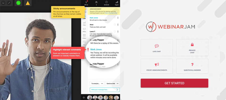
WebinarJam is one of my top picks when it comes to webinar platforms 2020. Webinar Jam is primarily built for marketers and a digital-first crowd. It’s one of the best webinar platforms available for webinar marketing.
WebinarJam is a very simple to set up webinar platform. The platform offers the best features to Live video casting, event streaming, and webinar broadcasting. The platform provides dozens of integrations and features to create great webinars.

If you’re a marketer WebinarJam is the best choice for you. It’s perfect for seamless “pitch making” at the end of the meeting, and the great UI/UX never leaves your attendees disappointed.
Pricing
- Basic –$499/Yearly
- Professional –$699/Yearly
- Enterprise –$999/Yearly
Features
- The platform has built-in email-marketing integrations with ActiveCampaign, ConvertKit, etc
- The platform automatically records the webinars, without you having to manually turn on the feature
- Works virtually on any browser
- Provides a built-in page builder that allows you to fully customize your registration pages.
- You can poll, questionnaires and surveys for your attendees
- Great marketing features, you can “sell” during and after the webinars.
- You can integrate it with your social media accounts.
- The drawing board feature lets you draw notes directly on top of your slides or diagrams to explain a concept.
- The platform lets you handle up to 5000 people per webinar, also you can accommodate up to 6 co-presenters
- You can make your Webinars live stream on FB live or YouTube
- “Panic Button” (Only on Pro and Enterprise plans): allows you “escape” from a bad webinar with the touch of a button. The system will then boot up a brand new live room and automatically transfer your attendees into it.
Pros
- The platform is extremely easy to use; within minutes you can get started
- Excellent chatting platform during the webinar that provides a great opportunity for audience engagement
- High-quality video-streaming
- Top-notch customer support
Cons
- WebinarJam email Notifications might sometimes end up in the spam folder
- Sound can be sometimes being delayed on webinars
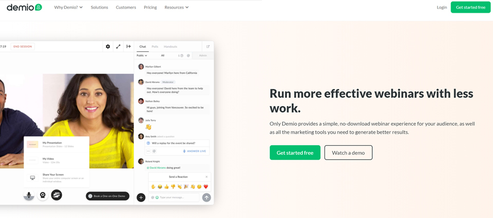
When it comes to webinar platforms 2020, Demio is a new kid! The platform has a crisp UI design and UX. Not only that, Demio has strong marketing capabilities and offers an all-in-one solution.
Whether you are looking to generate qualified leads/customers, active users, and increase conversions, or educate your customers, Demio is the perfect solution for you.

Demio is incredibly easy to use and making the entire webinar-creation experience as straightforward as possible. Also, the platform has a cloud-based recording feature that ensures top-notch video and audio quality.
Pricing
- STARTER –$34/Month, Paid Annually- 50-Attendee Room
- GROWTH –$69/Month, Paid Annually- 150-Attendee Room
- BUSINESS –$163/Month, Paid Annually- 500 -Attendee Room
Features
- The platform provides live, automated, on-demand or hybrid webinars
- Easy-to-use interface with great user experience
- The cloud hosting feature guaranteed HD video streaming
- The platform offers customizable registration pages
- You can send email notifications to registrants
- Polls and quizzes feature available with stats that you can view to assess audience engagement
- Provides advanced analytics feature
- The platform offers countless integrations
Pros
- The platform has a pro-level design and easy to use interface
- Web-based webinar solution
- Provides great automation features
- Well designed and compelling Polls and CTAs
- Great Audio and Video quality
Cons
- If you need more than 50 registrants, it can get expensive
- The platform’s replay page lacks marketing features
- New to the market so glitches might come up here and there
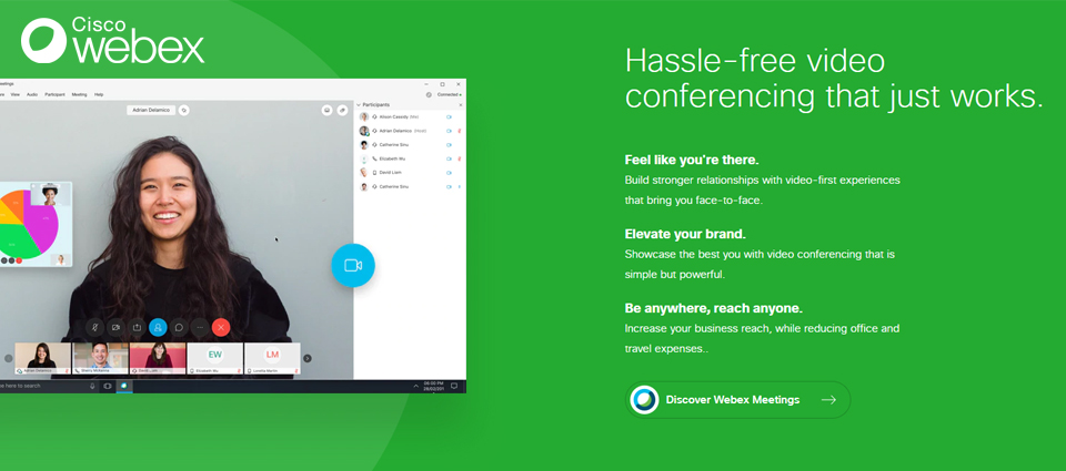
The leading IT firm Cisco owned the Webex software. Apart from the webinar, Webex can also be used for video conferencing, team collaboration and online training that help professionals to move their projects forward faster.
Webex provides integrated video, audio and content sharing features. You can keep your conversations private with highly secure Webex meetings that are powered by the Cisco Collaboration Cloud.

Though Webex can be used by smaller companies, it’s mainly aimed at large corporations and caters to the needs of these big businesses. Webex is one of the reliable, high-quality and feature-rich webinar platforms 2020.
Pricing
- Webex provides 4 different pricing plans. You can be billed monthly or annually. The “Free” plan is a great starting point but limited to 50 attendees only.
Features
- Entirely cloud-based webinar solution
- You can accommodate up to 200 attendees
- Provides Q&As, polls and surveys options to maximize your audience engagement
- Mobile app available
- Webex provides hardware devices that work in conjunction with the software
Pros
- Great platform for team collaboration
- Offers excellent video and audio quality
- The platform has great security features Webex provides meeting transcription (Starte plan or higher)
- The platform has a great customer support
- Webex offers a 100% free plan to get you started
Cons
- The platform is not fully optimized for marketing purposes
- The platform is best for large corporations
- Not a standalone webinar tool as originally built for video-conferencing
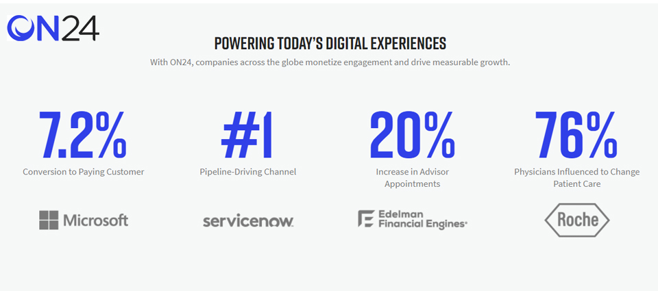
ON24 is one of the leading webinar platforms 2020. The platform is built from the ground up to be a dedicated enterprise webinar solution. ON24 has everything you might need from a great webinar platform.
ON24 is powering interactive, data-rich webinar solutions and content experiences that help people connect and make smarter business decisions.

Marketers can use ON24 to create Live, On-Demand and Personalized Engagement and drive more revenue through the platform.
Pricing
- Free Trial Available for 30 Days
- Live Demo Available
Features
- Easy to create, manage, deliver, measure and scale your webinars
- Provides data-driven engagement analytics
- You can integrate your webinars engagement data into your marketing automation platform and CRM system.
- The platform offers a customized interface for a better user experience.
- The platform offers an all-in-one webinar solution with extremely rich features.
- The platform provides live chat, Q&As, polls, voting and screen sharing options.
- ON24 offers customizable branding and social media promotion for customers
Pros
- ON24 provides a suite of powerful enterprise tools for webcasting
- The platform offers an engagement-first approach to the video experience
- Powerful interactive, intelligent and data-driven solutions to help you optimize your marketing efforts
Cons
- Extremely difficult to master the webinar software
- Requires a full hands-on effort to use the platform’s full potential
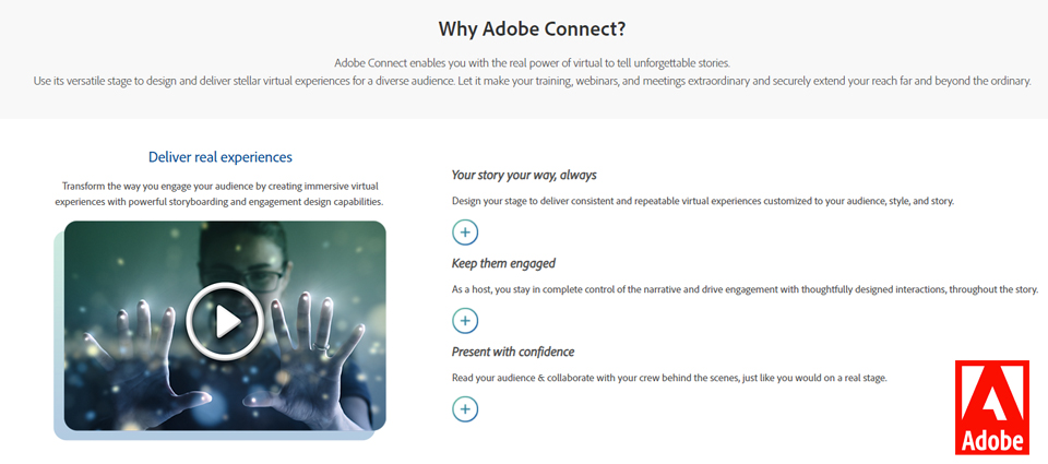
Adobe is popular for its art software like Photoshop and Lightroom. The Adobe Connect is the latest addition to the Adobe arsenal. Adobe Connect is a video-conferencing platform with webinar functionality.
Adobe Connect is one of the highly powerful webinar platforms 2020 that is tailored for enterprise use where you can conduct webinars, host videos, share documents and so much more.

With its general number of features, Adobe Connect can be a great option for hosting video conferences and webinars that provides great digital learning experiences.
Pricing
- Small Meetings – Free – 3 Participants
- Meetings – Starts at $50/Month/Host – 25 Participants
- Webinars & Learning – Starts at $130/Month/Host – 100 to 1500 Participants
Features
- The platform offers great analytics
- The platform has an easy to use interface
- The platform provides “Smart Q&A”, multiple poll types, ‘ice breakers’ and other engagement enhancers options
- Fully customizable “Prepare mode” and advanced host controls Webinar room features
Pros
- Great analytics feature
- You can integrate with your CRM software
- Provides great customizable templates
- To-notch audience-engagement features
Cons
- One of the most expensive webinar platforms out there
- The platform’s mobile experience can be improved
GoToTraining is one of the dedicated webinar platforms 2020 for online training. The platform is built by the providers of remote-access software bohemet LogMeIn. GoToTraining is the perfect webinar solution for online training within your company.
GoToTraining has great educational tools that allow trainers to create effective and engaging training sessions. Trainers can evaluate their students’ knowledge before the training via custom registration, distribution of course materials, and tests.

Compared to other all-in-one webinar platforms 2020, GoToTraining is extremely limited and niche, but it provides a good solution for online training.
Pricing
- STARTER – €107/Organizer /Month, Billed Annually – 25 Attendees
- PRO – €169/Organizer /Month, Billed Annually – 50 Attendees
- PLUS – €315/Organizer /Month, Billed Annually – 200 Attendees
Features
- Provides custom registration option
- You can manage your registrants’ payments and refunds through PayPal integration.
- Provides content sharing options like videos, PowerPoint presentations and course catalogs.
- You can evaluate your students’ knowledge with tests and polls
- Features to boost engagement and collaboration with small-group discussions
Pros
- The best webinar solution for company online training programs
- A great platform for educational and training webinars
Cons
- Specific Niche platform with limited features and functionality
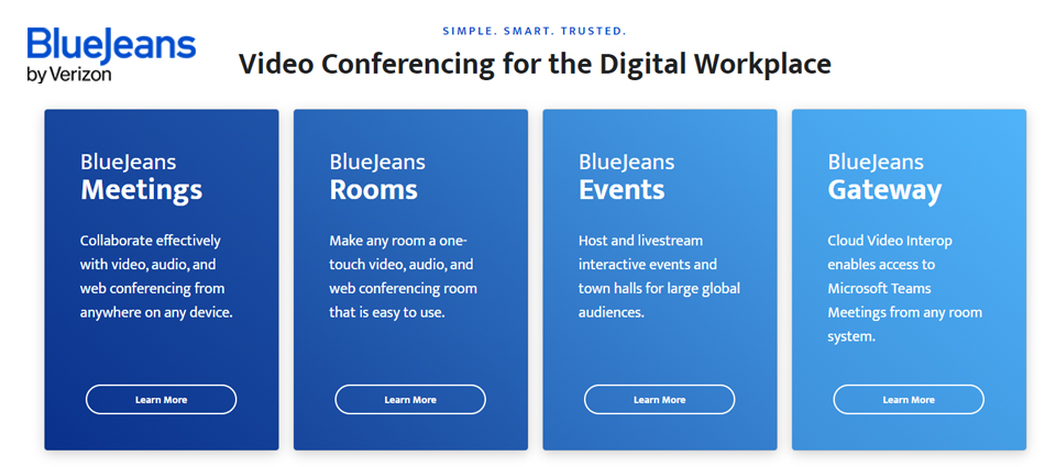
BlueJeans Events is a globally trusted live video streaming tool. It’s a great virtual event platform for thought leadership, keynotes and brand awareness.
BlueJeans specifically designed for marketing teams that aim to capitalize on audience participation. The platform provides a premium content delivery platform with a feature-rich moderator dashboard that supports a range of one-to-one and one-to-many communication options.

BlueJeans integrates with various marketing tools like Salesforce, Splash and Marketo to automate invitations, collect RSVP data, and accelerate the follow-up process. Plus, users can create virtual payment gateways with TicketSocket and stream webinars to Facebook Live or YouTube Live.
Pricing
Meetings
- BLUEJEANS STANDARD – $9.99 Host/Month – 50 Participants
- BLUEJEANS PRO – $13.99 Host/Month – 75 Participants
- BLUEJEANS ENTERPRISE – Custom Package
Events
- BLUEJEANS VIDEO WEBINARS – $83/Month – 100, 200, 500 Attendee Plans Available
- LARGE-SCALE VIDEO EVENTS – Custom Package – 50,000 View-Only Attendees
Features
- Provides attendee management feature
- Offers customizable branding
- Online registration and live streaming options are available
- Great reporting and analytics features
- Provides virtual lobby
- The platform provides a lead generation feature
- You can record & playback your webinars
- Survey and poll management feature with
- real-time chat option
Pros
- Fully web-based solution
- Best moderator dashboard
- Easy event setup and scheduling
- HTML embed allows event admins to stream content from their domain of choice
- Automated closed captioning and Intermission/pause broadcast features are available
Cons
- Fairly limited marketing features and customer experience
- Price is a bit higher but includes a wider range of built-in features
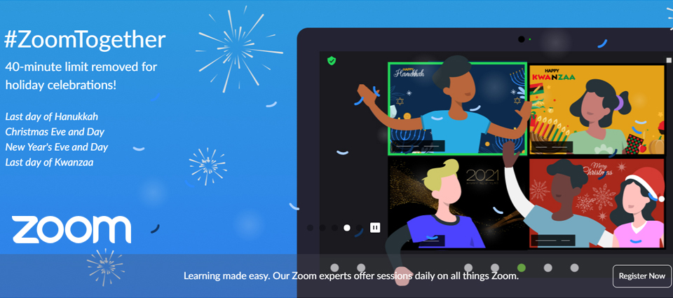
These days, everybody talking about Zoom. That’s because it’s one of the reliable, fast and extremely affordable webinar platforms 2020. But, Zoom originally born as a video-conferencing tool and recently it has come out with a solution that’s catered features and functionalities for host webinars.
Zoom provides HD video, audio, and content sharing features across different devices like mobile, desktop, telephones and conference room systems. Zoom has cloud and local recording features with transcripts and multi-user annotation capabilities via screen share.

Altogether, Zoom webinars are excellent in quality and have all the usual features you’d expect in a great webinar solution, however, they are a little thin when it comes to marketing features.
Pricing
- BASIC – Free – 100 Participants
- PRO – $149.90 /Year/License – 100 Participants
- BUSINESS – $199.90 /Year/License – 300 Participants
- ZOOM UNITED BUSINESS – $350.00 /Year/License – 300 Participants
Features
- Provides great HD video quality
- Extremely easy to use dashboard
- You can integrate with Google Calendar, Microsoft Outlook, and iCal
- You can bac-up meetings in the cloud
- Multiple attendees can screen share at the same time
- App available for iOS and Android devices
- Live broadcasting with the connecting option to Facebook and YouTube live
- You can create on-demand or recurring webinars
- The platform supports for larger events
- You can integrate Zoom with PayPal through Zapier
Pros
- The platform Can be used for free with limited features
- Provides great video and audio quality
- The meeting scheduling process is extremely easy and straightforward
- Go-to webinar solution for many users
Cons
- The platform’s webinar feature is still ‘young’, so there’s room for improvements
- Marketing and sales features can be improved
- The automation process can be improved
- Generally, the platform is very stable, but some users have reported it crashing sometimes
Skype for Business is one of the useful video conferencing and IM tools that can become your to-go-to webinar service. On Skype for Business, you can schedule a meeting that’s similar to a webinar with up to 250 attendees.
Skype for Business allows you to chat, audio & video conversations, schedule & facilitate online meetings for your internal & external teams and provides features for dial-out & dial-in online conferences.

Overall, Skype for Business is one of the best solutions for Collaboration, Communications, Enterprise Messaging & Mobility Management.
Pricing
Features
- Best HD video and audio calling features
- Smart messaging with emojis and reactions
- Screen sharing option available
- Provides features like call recording and live subtitles
- You can do private conversations on the platform
Pros
- Available for desktop and mobile devices
- You can host a meeting for up to 250 attendees
- You can manage the access of the participants through phone call
Cons
- Not an exclusive solution for the webinar, originally, it’s an IM and business communication/video conferencing tool.
18) ezTalks Webinar
ezTalks is designed for providing reliable web conferencing and video conferencing solutions. So, relatively it’s a new player in the webinar space. With its mobile-first approach and a range of features, it’s already a successful web conferencing solution.

ezTalks offers cloud and on-premise software with powerful features like HD video & audio Chat, screen sharing, record, whiteboard, etc. Also, with its high-quality video conferencing tools and integrated software, ezTalks provides a simple and collaborative video meeting experience.
Pricing
- STARTER – Free – 25 Participants
- STANDARD – $25/Month/Host – 50 Participants
- PRO – $32/Month/Host – 100 Participants
- BUSINESS – $300/Month/Host – 1000 Participants
Features
- Unlimited live webinars
- Provides HD video and audio
- Offers custom registration page
- Screen sharing feature with co-annotation
- Custom branding and Social media sharing
- You can replay & download recordings
- Webinar cloud storage available
- Polls, surveys, instant chat options
- Interactive whiteboard feature
Pros
- A new disruptive startup in web conferencing space
- Built with the purpose to serve webinar marketing space
- Offers both free and paid webinars
Cons
- A bit difficult to get set up
- As a newborn, it comes with its limitations and bugs
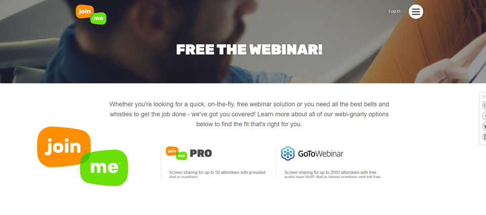
joinMe is a video conferencing tool with easy to use simple functionalities. The tool allows you to quickly go live and share your link with attendees in a rapid manner.
Even though joinMe is not a perfect webinar solution, it’s a good choice for you, if you’re looking for a quick and rapid tool for a webinar-based meeting. Especially if you have high-ticket LinkedIn Clients, this webinar solution might be the right choice for you to create a webinar meeting and connect directly with them.

Overall, joinMe is the easiest way to connect and collaborate. Anybody can share ideas instantly with screen sharing, video, audio, whiteboard and chat options. joinMe provides a personalized meeting experience where users can personalize participant URLs, backgrounds and much more.
Pricing
- LITE – $10 – 5 Participants per Meeting
- PRO – $20 – 250 Participants per Meeting
- BUSINESS – $30 – 250 Participants per Meeting
Features
- Video conferencing and audio conferencing features
- Advance meeting scheduling option
- You can set up your own custom link for meetings
- Whiteboard feature available for mobile and desktop devices
- Provides screen sharing and presenter swap options
Pros
- Simple and reliable webinar solution
- Affordable and extremely easy to use webinar software
Cons
- A limited number of webinar-first features
- Limited to only 50 attendees
WorkCast makes webinars and webcasts simpler and more engaging that allowing you to generate more leads and connect with your global audience virtually.
WorkCast is a web-based solution so there is no downloads, no plugins, and no barriers for webinar presenters and attendees. Simply, WorkCast is one of the effective webinar platforms 2020 to maximize your audience engagement, generate leads and grow your business.

Pricing
- Present+ – £95/Month – 500 Attendees
- Producer+ – £395/Month – 500 Attendees
- Enterprise – Custom Package
Features
- Lead generation features with webinars
- You can connect with a massive number of a global audience
- You can able to host flexible and cost-efficient training via webinars
- Boost sales through products demos
- You can have meaningful interactions with your customers
Pros
- The platform provides easy setup and integration
- Provides helpful Customer Support Team
- The platform offers embedded webinars and a full suite of features
Cons
- WorkCast constantly improving and upgrading its features and functionalities, means you’ll have to deal with bugs in the process
3. Proven Tips & Tricks to Use Webinar Platforms
Anybody can use webinar platforms and run a live stream. But, to successfully collect leads through webinars and turn those leads into customers you need some effective tips & strategies that actually work.
So, here are some of my best tips to make your webinars experience memorable for you and your audience.
- Ensure good audio and video quality
- Personalized your webinar according to your specific audience
- First, give value to your audience then do the sales pitch
- Learn from your own webinars and improve them
- Get to know your audience’s interests and create webinars on them
Conclusion
There you have it all! It pretty much rounds up the list of top webinar platforms 2020. Now, it’s time to identify the best webinar platform for your business. For that, you need to consider several things. If you’re a beginner, see what fits your budget and then compare the features accordingly.
Next, you need to identify what size your audience is and what specific features & functionalities you might require to engage your audience.
Also, consider what’s your end goal? Whether do you want to increase your sales, boost your brand awareness or need to conduct a survey? It’s important to choose the right webinar solution that offers the specific features you need.
The best part is that most of these webinar solutions offer a free trial or money-back guarantee, which helps you to test out the product before you go for a paid plan. When you find the right solution, then you can make the final purchase.
I tried to do my best to analyze and review the best use case frameworks for the top 20 webinar platforms 2020. I hope you found it insightful.
Now I’d like to hear from you….
What’s your experience with hosting webinars? Have you ever tried any of the above webinar platforms 2020?
And, let me know if you have any other favourites. Feel free to share your thoughts in the comments!


